
Project Overview
Product
GO Tracker
Year
2020
Business Request
Internal stakeholders engaged the Metrolinx Digital Team for a recommendation on moving forward with a product redesign and deployment for the existing GO Tracker product.
My Role
Audit the existing product and identify accessibility, heuristic and other UX issues.
Analyze existing data: customer feedback from the Contact Center, social media, customer survey results, Google Analytics.
Look in market at other world-class transit agencies to see how they are serving real-time data to customers.
Assess the current task flow.
Design and propose a solution that can be carried forward for stakeholder buy-in and user testing.
GO Tracker Current State
Product Audit Results
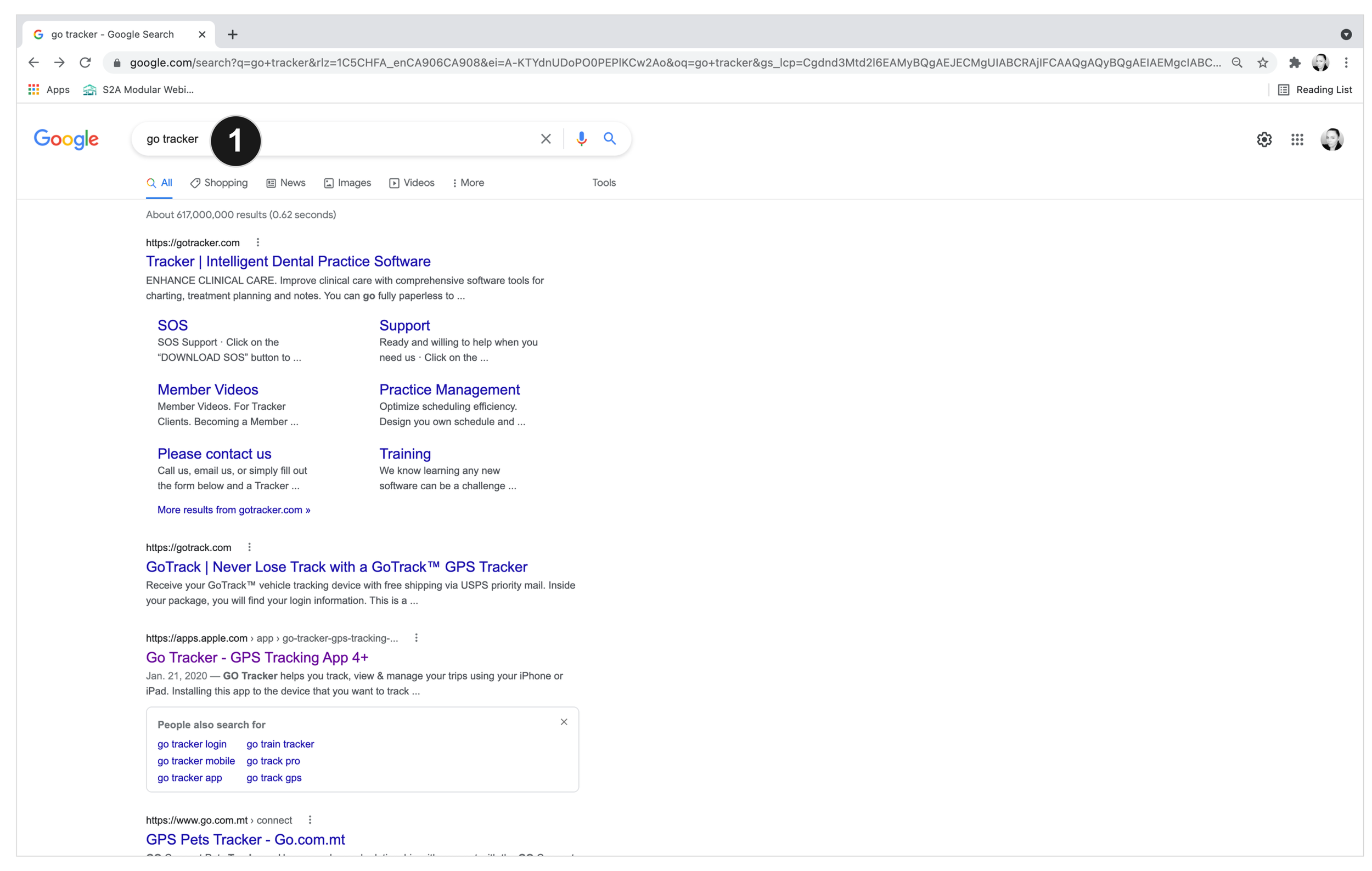
The site is not optimized for SEO, and even when searching for the current product name it doesn’t appear in top search engine results.
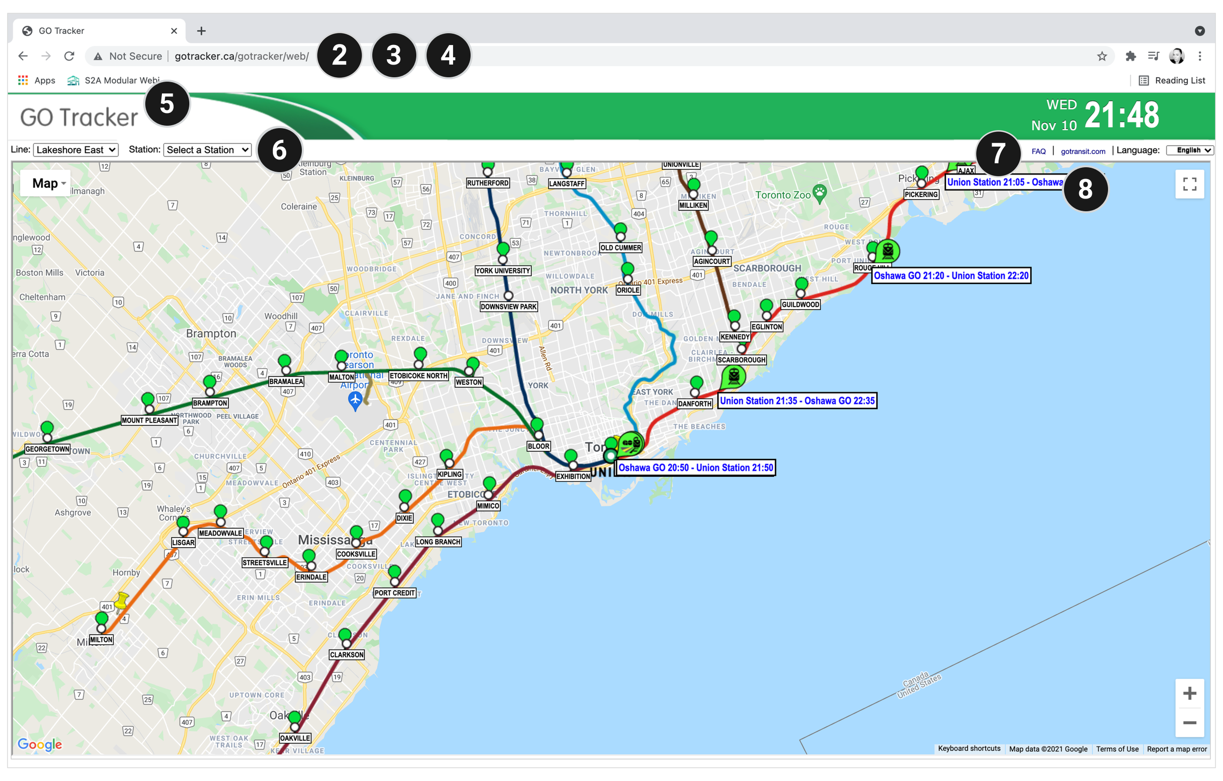
None of the current pages have UTM or GTM codes making it impossible to track web data.
The site doesn’t hold a secure SSL certificate.
Design is not mobile responsive.
Doesn’t follow current visual identity or design system guidelines.
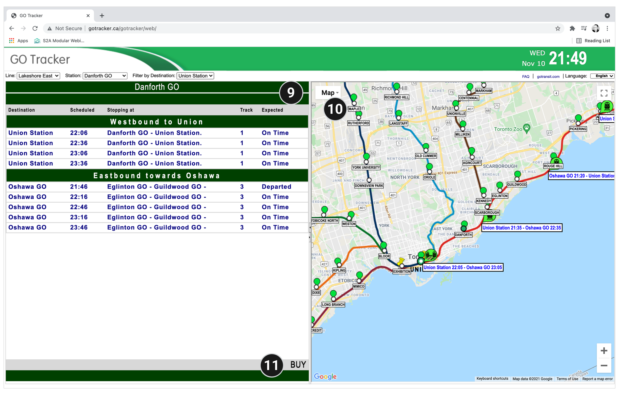
Dropdown touch targets are too small and require a minimum area of 44px.
Font is not accessible, multiple font sizes, styles and weights.
Lives in obscurity due to its lack of integration with the main GO Transit website.
Doesn’t follow current visual identity or design system guidelines.
Font is not accessible, multiple font sizes, styles and weights.
Scrolling notification bar is broken and doesn’t display a complete message.
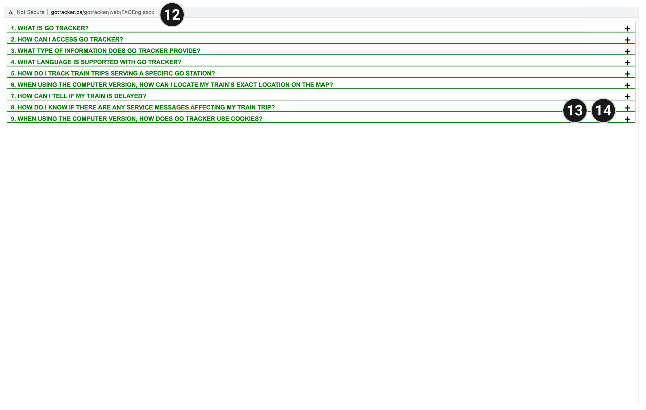
Interface opens the FAQ in a separate tab instead of allowing the user to X (close) out or move back in the flow.
Accordion touch targets are too small and require a minimum area of 44px.
Accordion doesn’t support multiple open sections.
Because the business didn’t have any qualitative or quantitative data for the product, the v1 redesign was based on my hypothesis that users need to be able to find all GO products and features in a centralized hub, creating a wholistic, integrative experience.
Proposed State Mockup V1
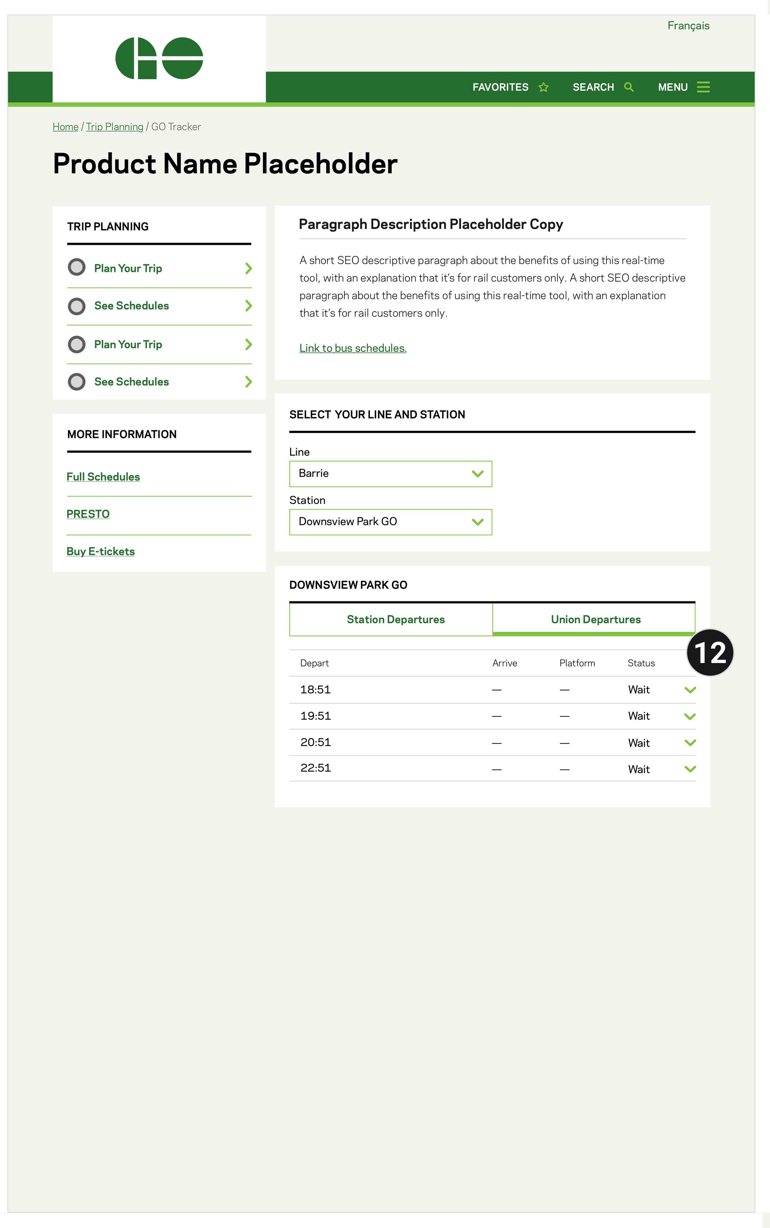
Redesign Proposal Overview
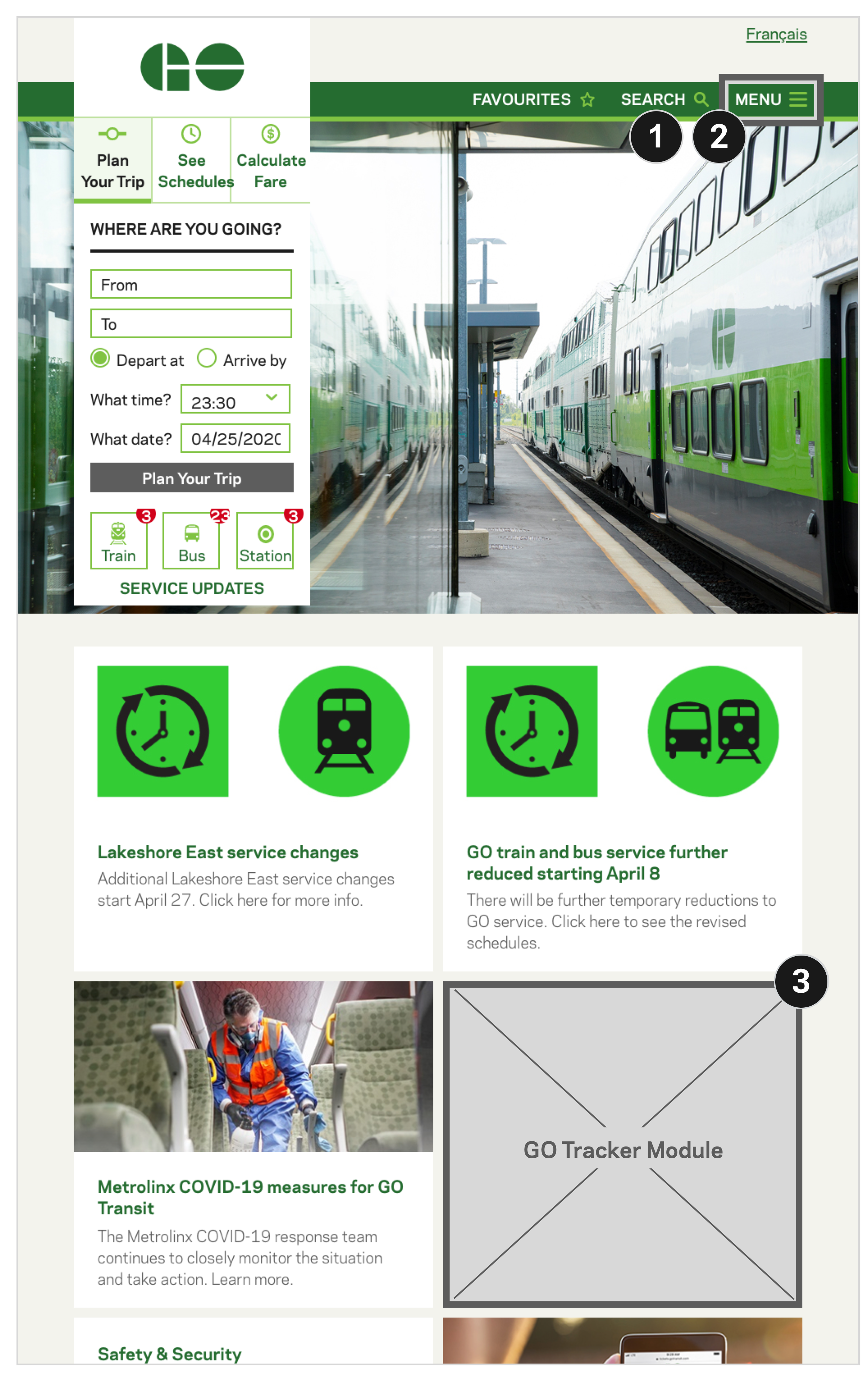
Implementation of Google tracking and analytics.
The product becomes an integrated feature within the wholistic GO Transit ecosystem alongside the service updates, trip planner, scheduling, and fare calculation tools.
Visibility and awareness has been brought to the product by placing a feature card on the GO Transit homepage.
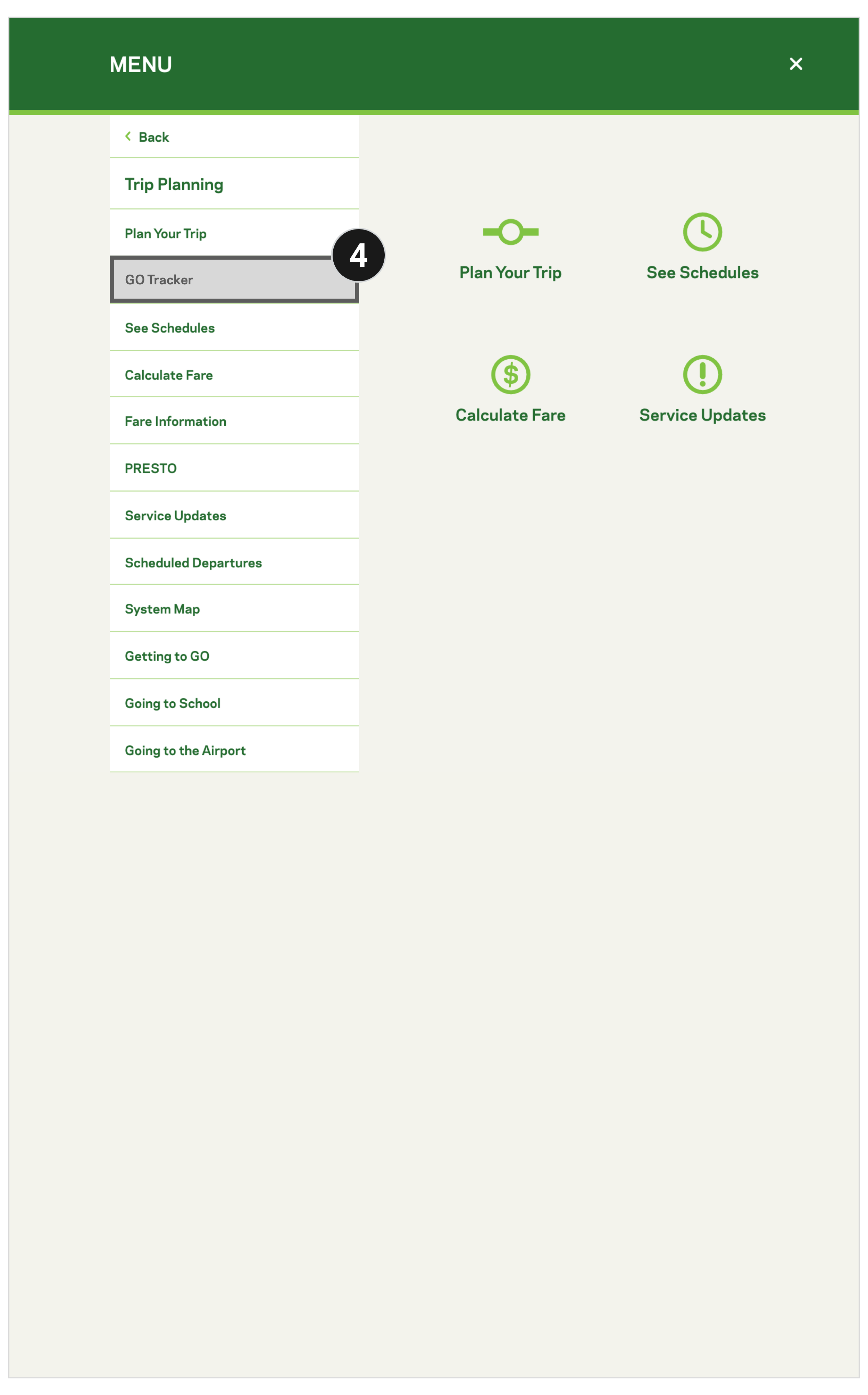
The product is added to the secondary menu under Trip Planning.
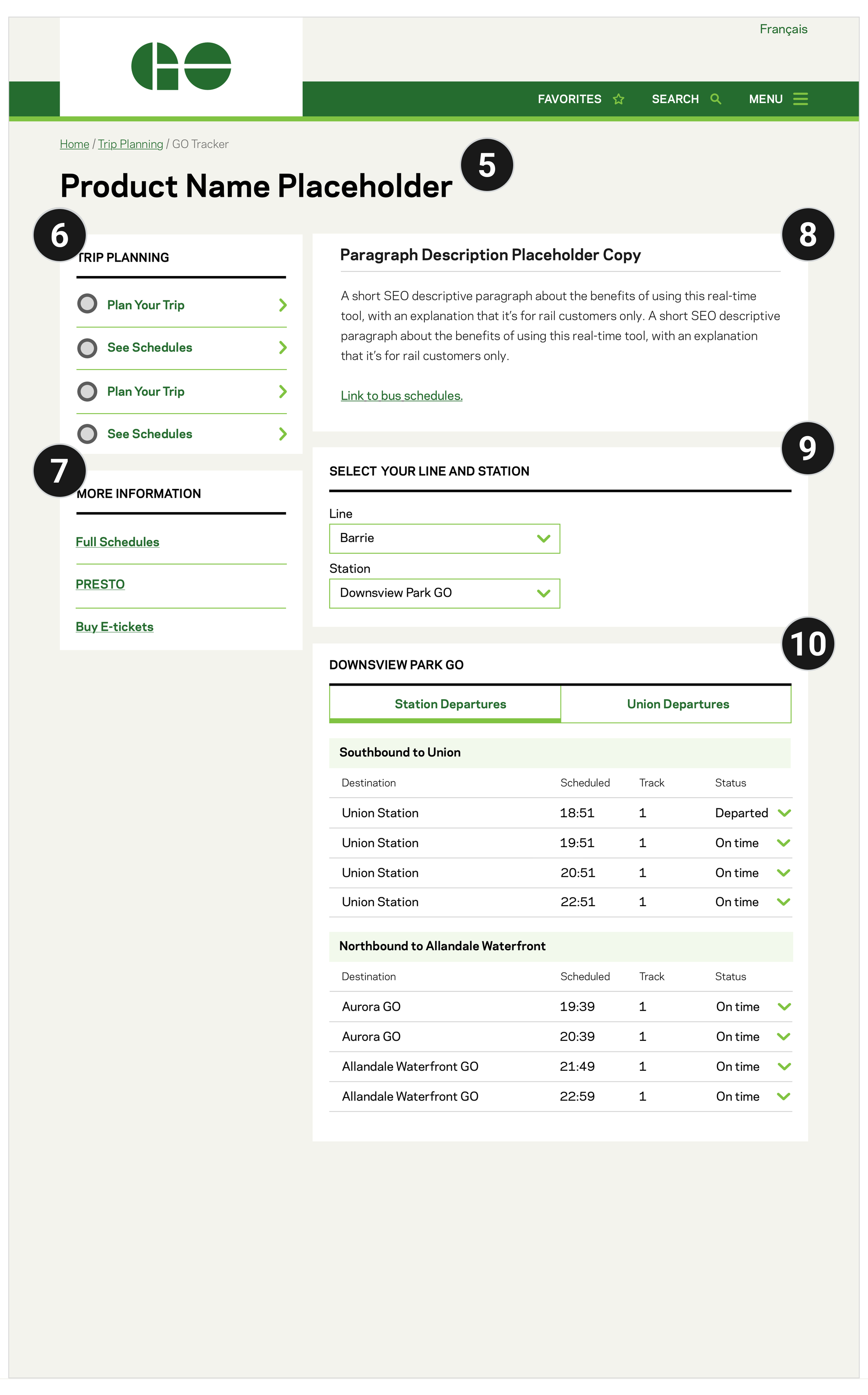
Re-evaluation of the product name is suggested, and to be validated through user testing.
Net new design pattern exploration featuring an icon and chevron, allowing for customers to open a widget or side sheet without having to leave the page. User testing validation required.
A standard module is maintained to allow users the freedom to access other fare and schedule-related information.
SEO-optimized page content to drive traffic to the feature. Alternatively, a separate landing page could be created for this purpose and link to the schedules page alleviating the need for FAQs.
A standard module pulls from existing design patterns.
Implementation of an existing module. Logic was retained for minimal development impact - Data is now filtered using an existing dual tab design pattern instead of using a third dropdown. The API calls remain the same as the current state, the content is simply restructured.
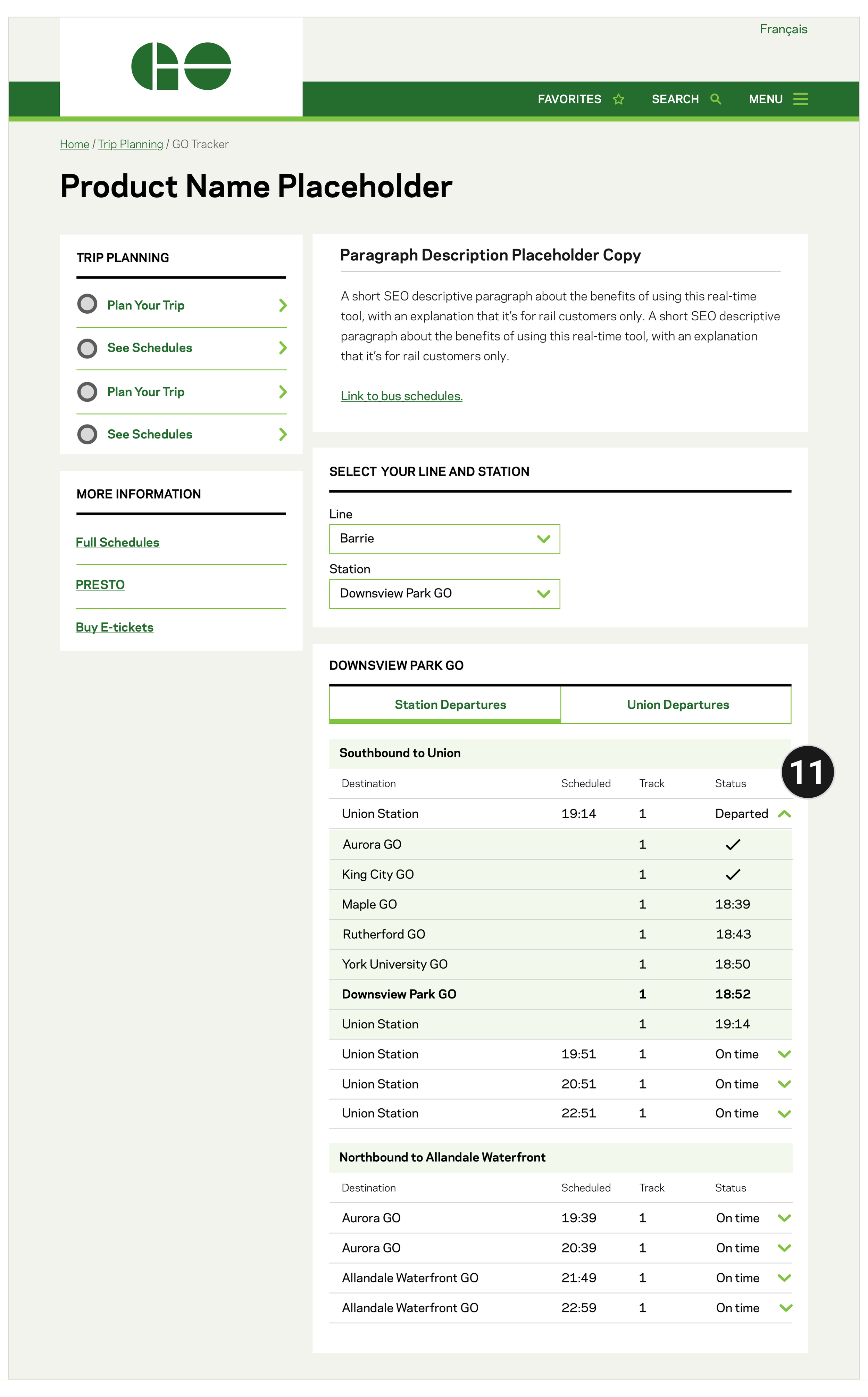
Complete trips are grouped within a dropdown and data is populated in the table instead of on the map, with the customer’s station appearing as the table heading and within the table in bold. Checkmarks appear to visually mark stations that the train has already arrived at.
Union Departures pull from a second API and are indicated by the platform, with data being populated 10 minutes before scheduled departure.
Next Steps
Set up avenues to collect qualitative and quantitative data.
User test v1 prototypes with customers to determine if customers will use the feature, or if data is better served as an integration within the current trip planning tools.
Present the POC highlighting opportunities and customer value to stakeholders making it possible to acquire buy-in for budget.
Refine the designs based on customer feedback, test again, with the possibility of developing an interim fix prior to site re-platforming.
Site re-platforming to include design work exploring a wholistic trip planning experience that surfaces scheduling, real-time, and fare information similar to experiences like Triplinx, Uber, and Google.
© Kristen Iboi 2026